Guardian Insurance
Brand Identity (Rebrand)
2016
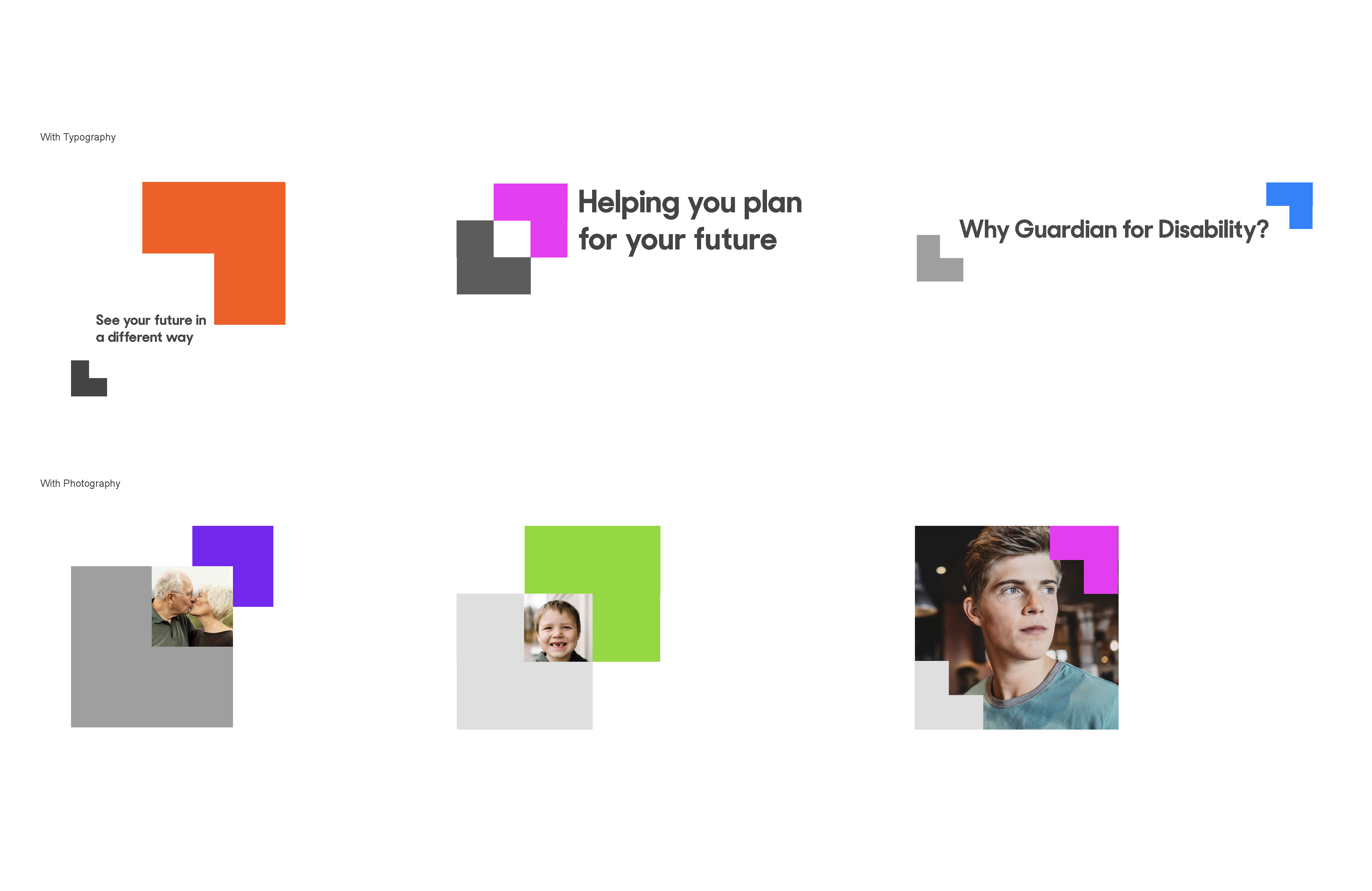
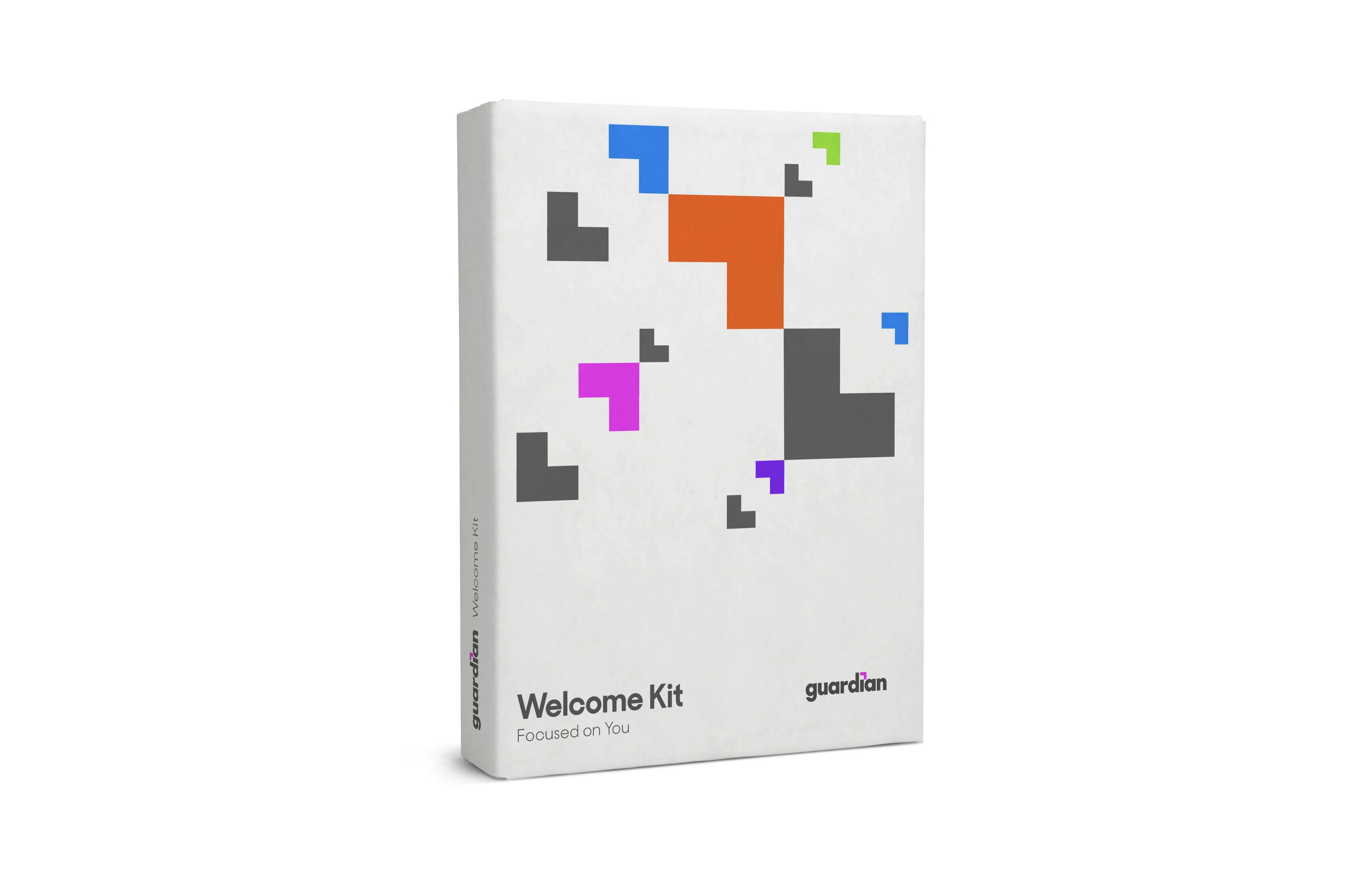
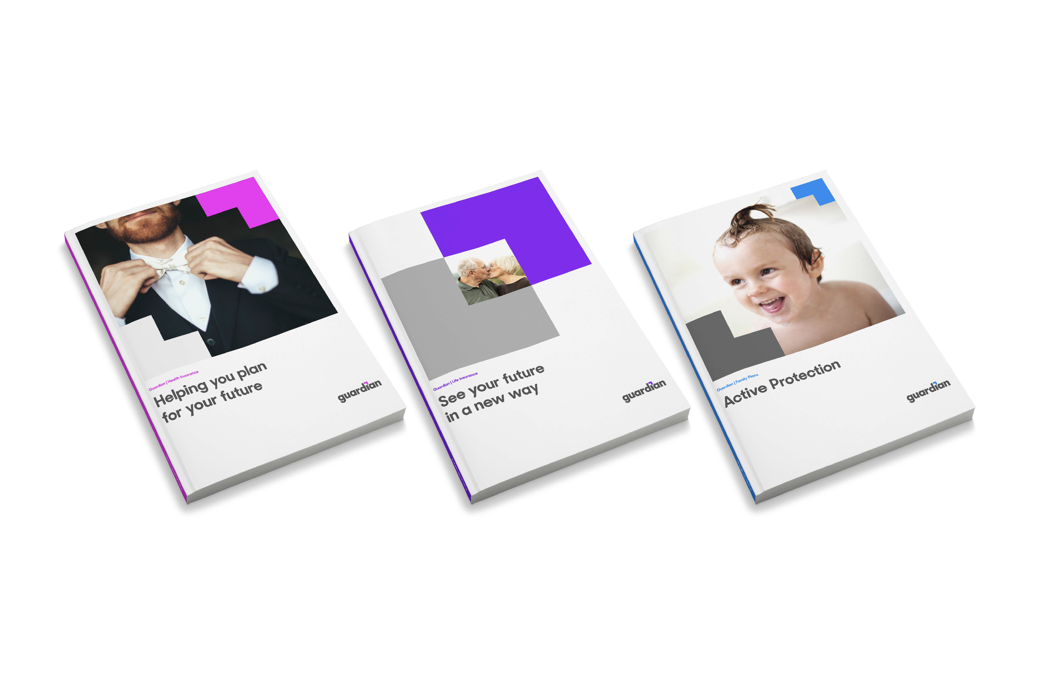
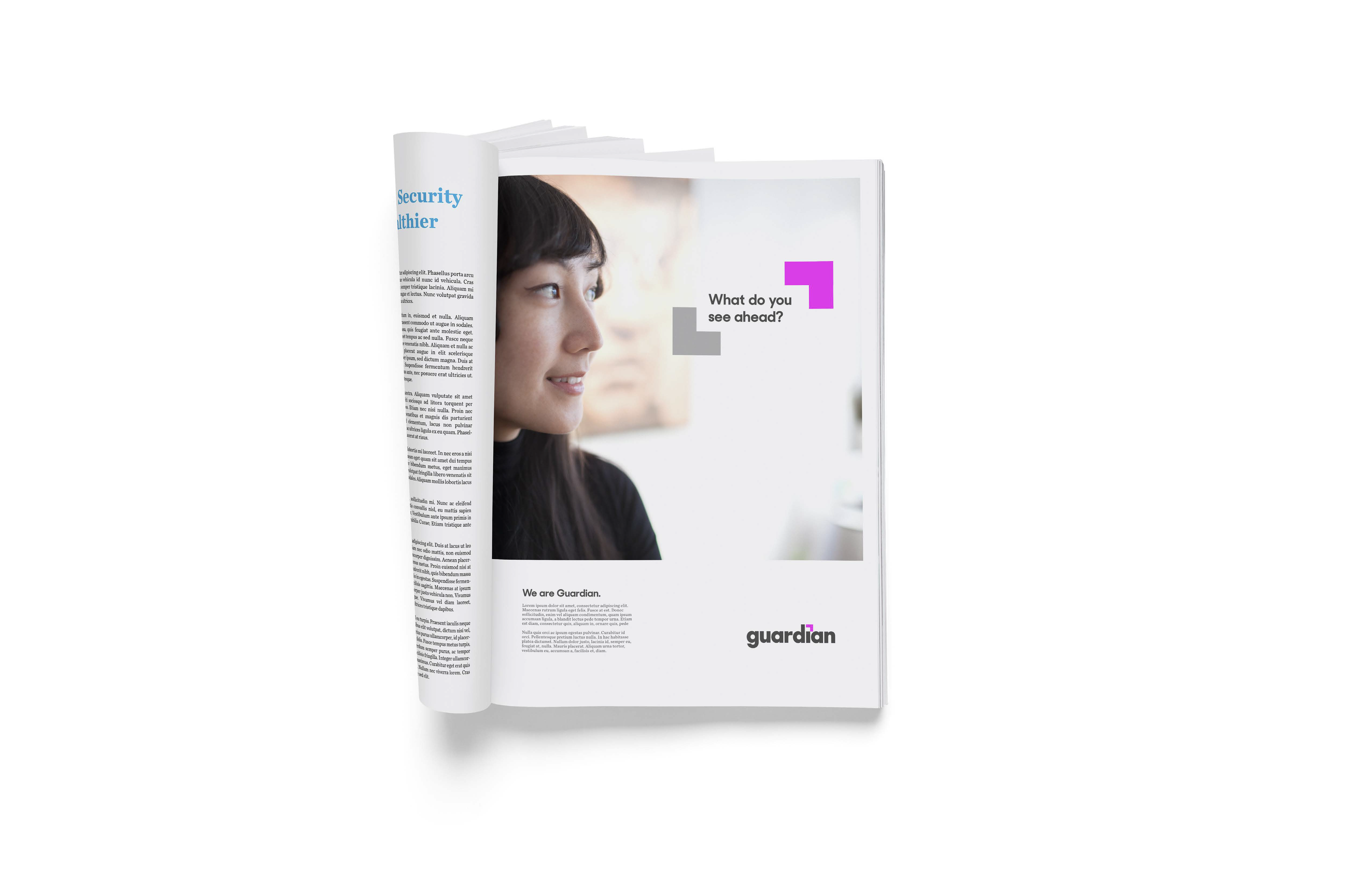
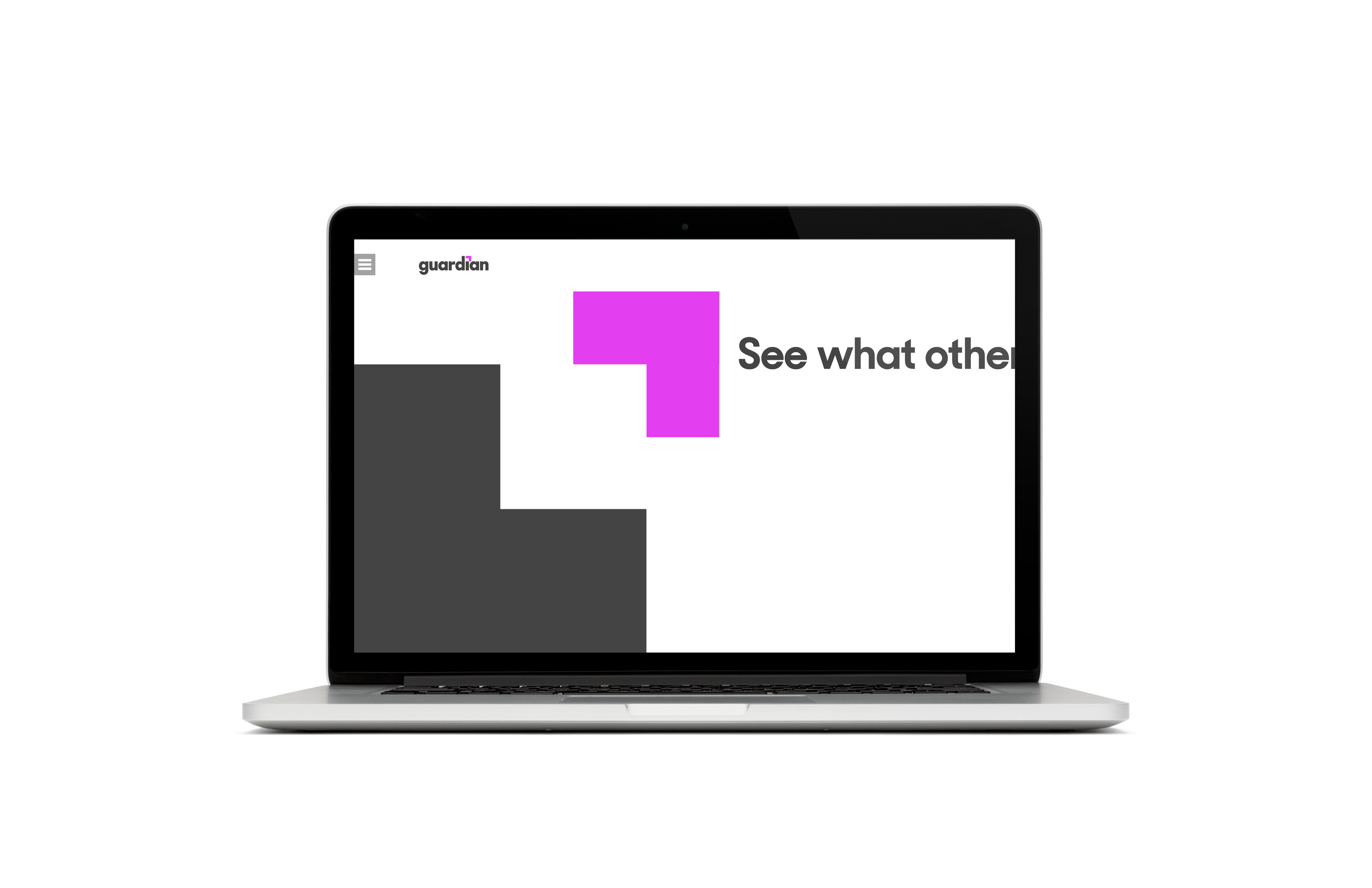
A modern, flexible rebrand for Guardian Insurance’s visual identity. The modular, adaptable identity system is menat to work for both B2C and B2B audiences.








Raymond is a seasoned creative professional who specializes in brand and innovative strategy, as well as graphic design and art direction. With a bachelor’s degree in film, Raymond’s approach to design combines his affinity for narrative storytelling with his dexterity as a visual communicator.
For over 10 years, Raymond has helped clients overcome business challenges by guiding them in telling their own story—through the power of purposeful design. Since 2015, he’s served as an adjunct instructor at NYU’s School of Professional Studies, where he teaches the continuing education course “Building Brands with Purpose”.
Raymond’s brand experience includes Air Canada, Amazon, AstraZeneca, AT&T, Bloomberg, CIT Bank, Church & Dwight, Eli Lilly, Elizabeth Warren for President 2020 Presidential Campaign, Entercom Communications, Ernst & Young (EY), Gap, Inc., Goldman Sachs, Guardian Insurance, ICF International, Johnson & Johnson, MasterCard, Mayo Clinic, Merck, PubMatic, Sanofi,
T-Mobile, Univision Communications, Inc.
If you’d like to know more about the work you’ve seen here, discuss a new project, or say hi, feel free.
—
forbes.raymond@gmail.com
LinkedIn
Instagram
Mixcloud
![]()
—
forbes.raymond@gmail.com
Mixcloud
